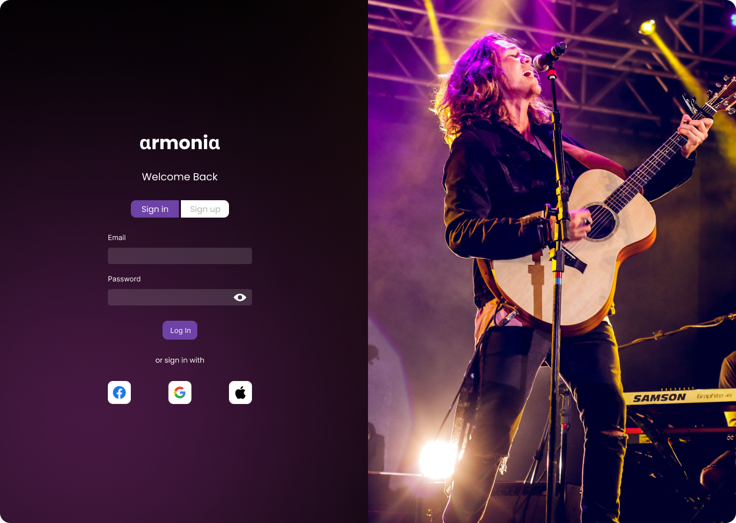
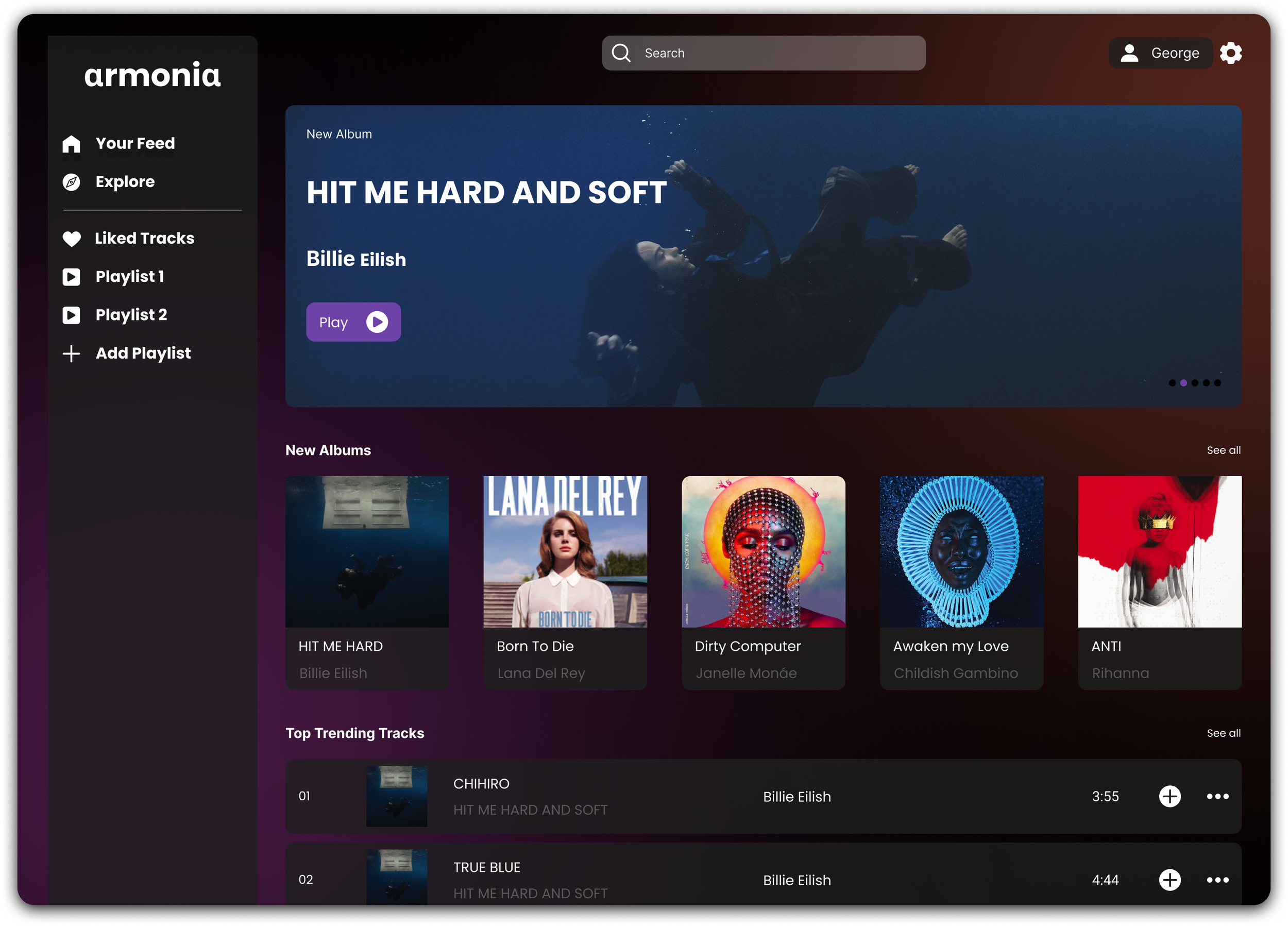
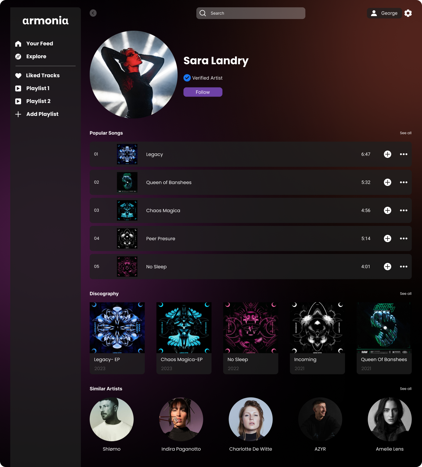
Armonia

A desktop music app aiming to provide a delightful and user friendly way for people to browse and listen to their favourite tunes and any new beats.1. Competitor analysis
I conducted an in-depth competitive analysis of various music apps to inform the design of my own. This involved evaluating the user experience, interface design, and feature sets of leading platforms like Spotify, Apple Music, and SoundCloud. I analyzed their strengths and weaknesses, identifying common pain points and opportunities for improvement.

Spotify
Spotify excelled in personalization and discovery features, however, some users found the app’s interface cluttered, especially with frequent updates introducing new layouts. While the app’s social sharing features are strong, navigation between playlists and settings could be more intuitive.
Apple music
Apple Music stood out for its seamless integration with the Apple ecosystem , however, its UI was less user-friendly for non-Apple users, with navigation occasionally feeling clunky, especially when managing large music libraries.
SoundCloud
SoundCloud’s strength lay in offering a unique community-based experience, however, the user interface could feel outdated and less polished compared to competitors. Discovery features also lacked the refinement seen in other platforms.

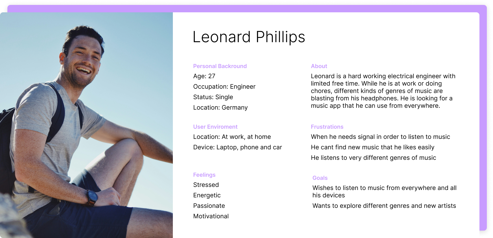
2. Personas
I moved on into developing user personas hoping to keep the design process focused while still being able to address the extremes of users needs. As such the two personas that came about where those of the casual user and the frequent user.
3. Card sorting
During the card sorting excercise I provided each person with a set of cards representing key features, categories, and functionalities of the app, such as "Playlists," "Search," "Genres," "Library," "Now Playing," and "Settings."
Some grouped the features by functionality, while others preferred to organize them by frequency of use. Most users placed "Playlists," "Library," and "Search" together, associating them with the core music experience. However, "Settings" and "Account" were consistently grouped separately, indicating that users see these as administrative features that should be tucked away.
In the following discussion, topics such as discovery vs personalisation came up consistently between individuals.
Participants: 5
Duration: 2hrs
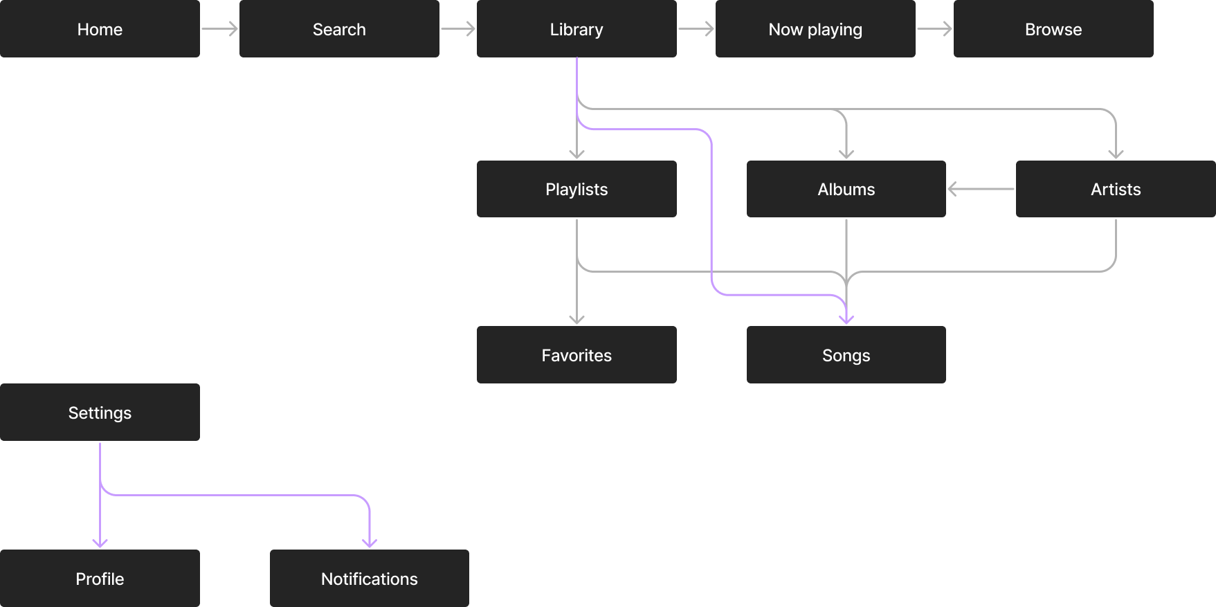
4. Information architecture
I developed a comprehensive information architecture (IA) for the application to ensure an organized and user-friendly structure. This involved defining the hierarchy and relationships between different sections and features of the app. By creating sitemaps and wireframes, I was able to visualize and validate the overall layout and navigation flow.


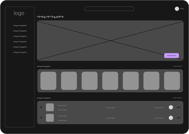
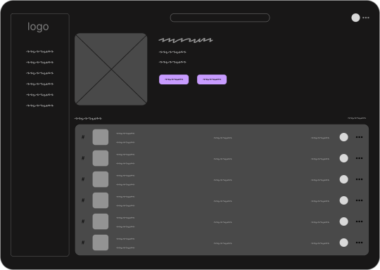
5. Wireframes
I created low-fidelity wireframes to outline the basic structure and layout of the music app. These wireframes served as a visual guide to demonstrate the placement of key elements and the overall navigation flow. This coupled with palette & font selection was my final step before final designs.


Armonia music app


Other projects