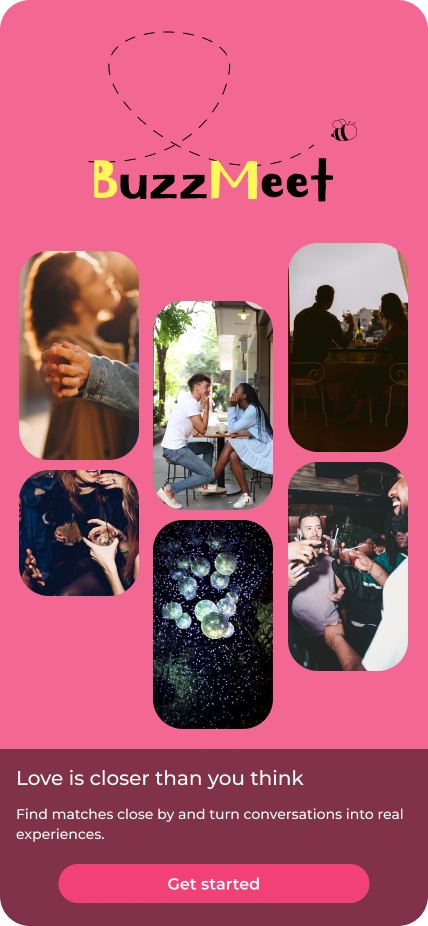
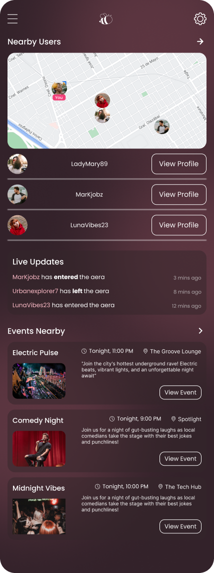
BuzzMeet

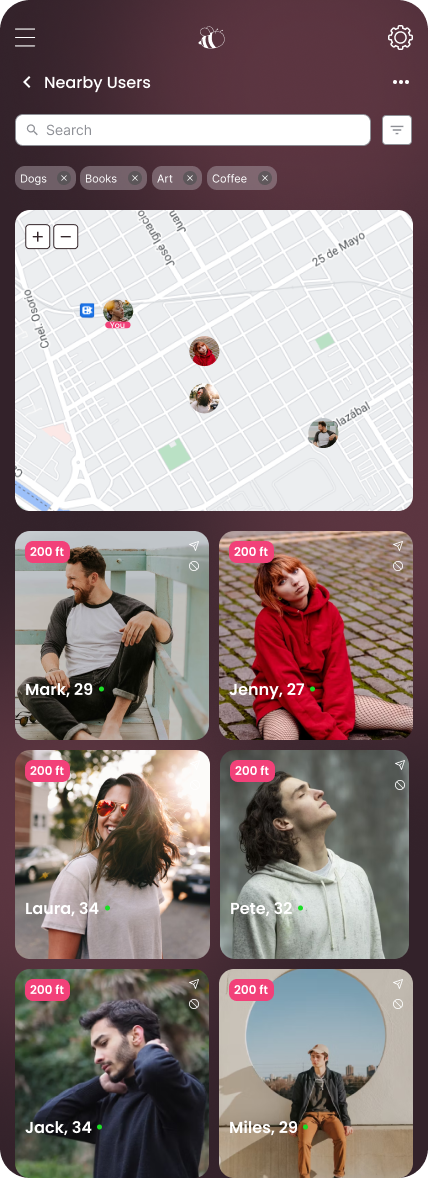
In this project I tried to redefine the dating experience through intuitive, human-centered design that fosters genuine and comfortable connections. Instead of traditional swiping, the app highlights nearby people and local events to encourage real-world connections.1. Market research
To better understand user behavior and industry standards, I analyzed three existing dating apps focusing on the design patterns and overall user experience. The goal was to identify strengths, gaps, and opportunities for innovation in how users discover, connect, and communicate.
Tinder
Tinder’s minimal interface and clear interaction model make it incredibly easy to start using without explanation.
However it’s swipe-based interface is simple and addictive, but it often prioritizes speed over depth. This repetitive swipe gesture creates decision fatigue and also the Limited context about users leads to superficial judgments.
Bumble
Stands out for its user empowerment and focus on safety, creating a more comfortable environment for many users. Its positive tone and approachable visual language make the app feel friendly. On the other hand, its time-limited interactions can create pressure, and the navigation between multiple modes (dating, friends, business) can feel confusing and cluttered.
Hinge
Successfully promotes authentic connections through detailed prompts and personality-driven profiles, which add depth to the user experience. The app also maintains a clean, well-balanced visual design. However, the onboarding process is long and mentally demanding, and the card-style browsing still limits exploration, keeping users in a linear discovery flow.
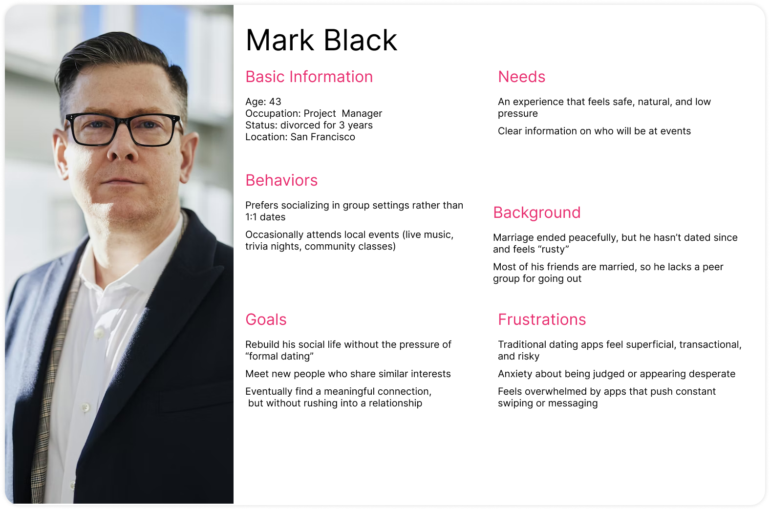
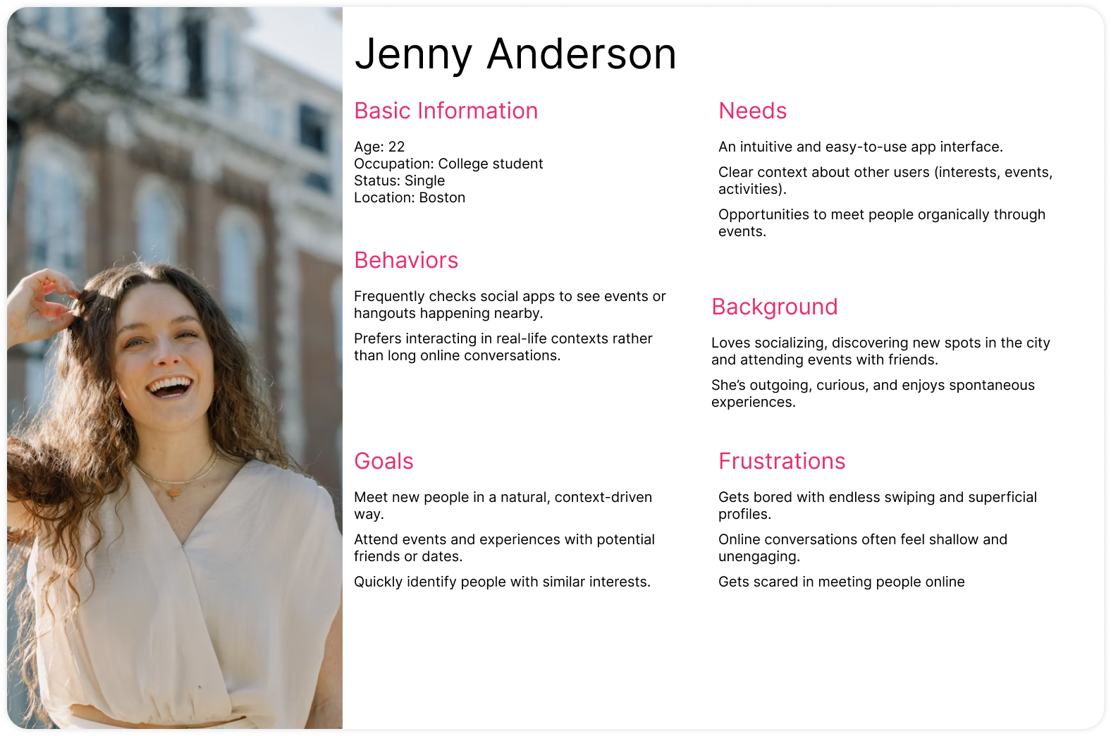
2. Personas
To better understand user behavior I developed two key personas to guide the design of the dating app experience. These personas help ensure the app addresses the needs, motivations, and frustrations of different user groups.
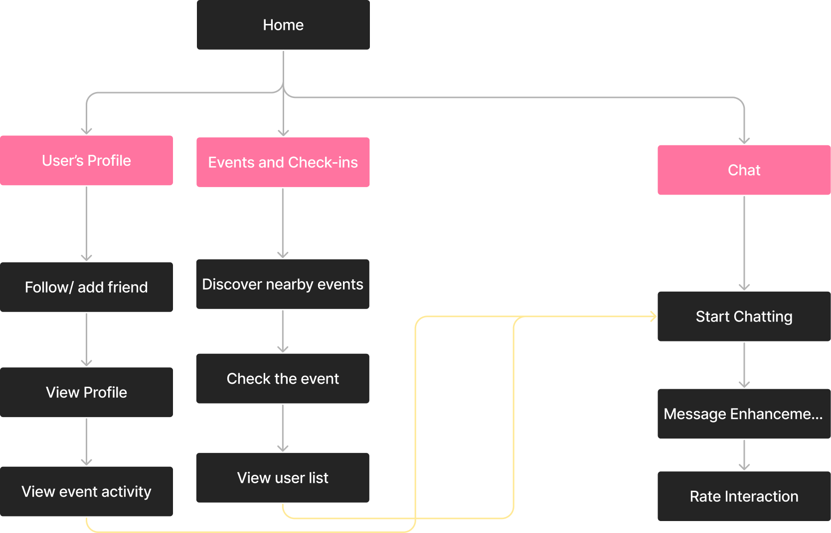
3. Content Map
I also developed a content map to organize all the information and features within the app. It defines what content appears in each section and shows how these pieces relate to one another. This ensures consistency, clarity, and a structured foundation before moving into detailed wireframes and UI design.
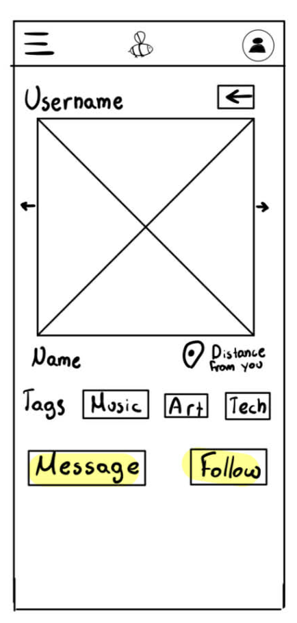
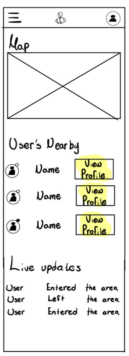
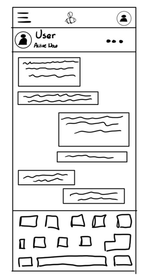
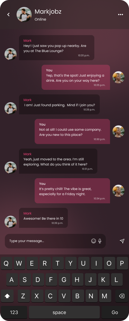
3. Wireframes
I created wireframes to visualize the core layout and user flow of the app. These low-fidelity screens focus on structure, hierarchy, and functionality without the distraction of final visuals. They help validate navigation, placement of key features, and overall usability before moving into high-fidelity design.

BuzzMeet Dating app
Other projects